 What is the app main design style?
The main design of the app is the ability to configure the design by setting the options in the style that the user wants, in addition to the original swing2app setting design theme.
If you select a prototype in the design theme and set the skin color, it will be displayed as it is set in the app.
When you add this feature, you can put a background image in your main home page, shade it, or make it transparent.
*The app’s main design style is optional, not a mandatory feature. It is optional!! So please check and apply the style you want. ^^
★ How to use App Main Design Style
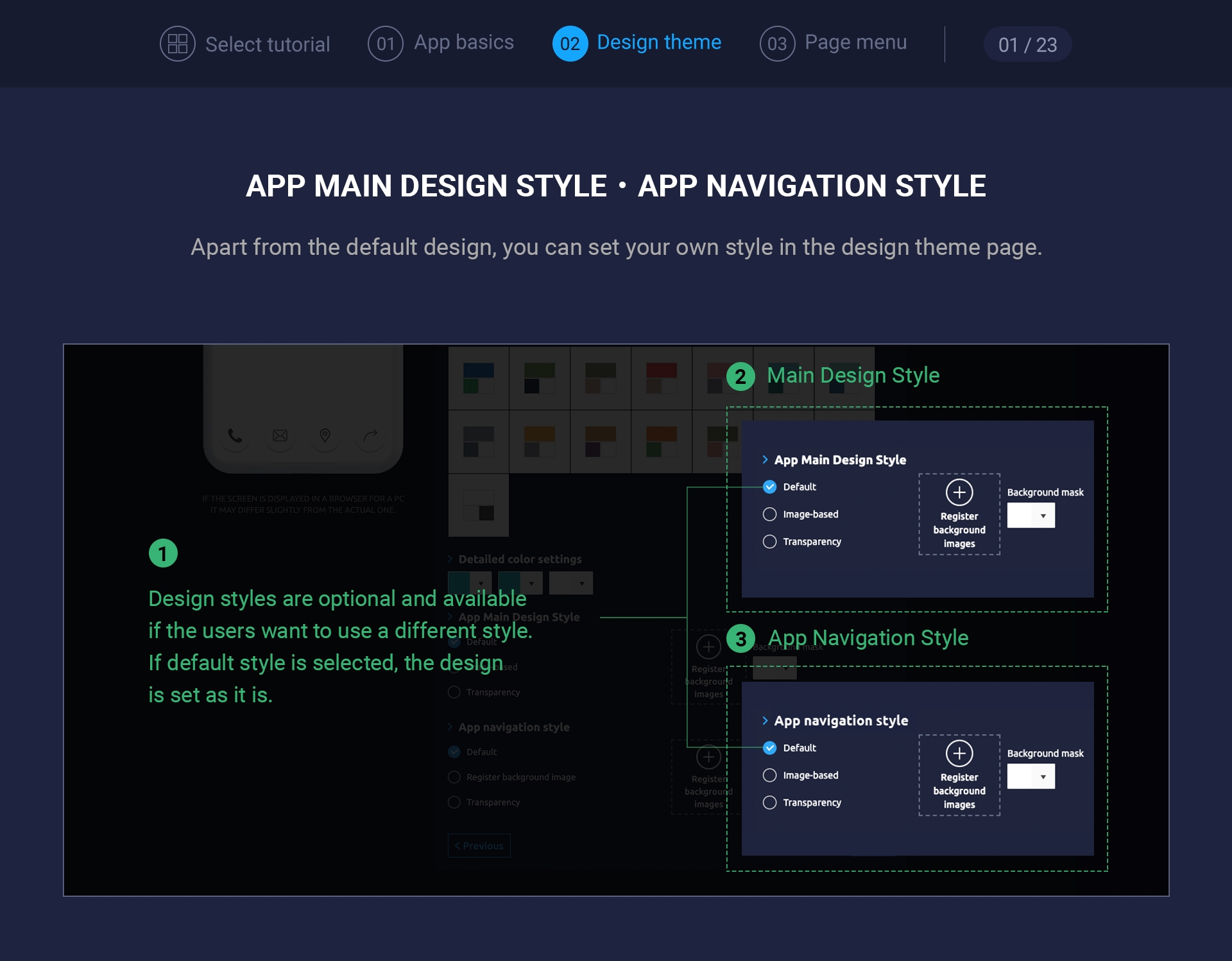
App main design style can be found in the design theme page.
You can select a prototype, choose a skin color, and then check it out.
These features are not required, but they are optional, so you don’t have to apply them.
1. App Main Design Style – Default
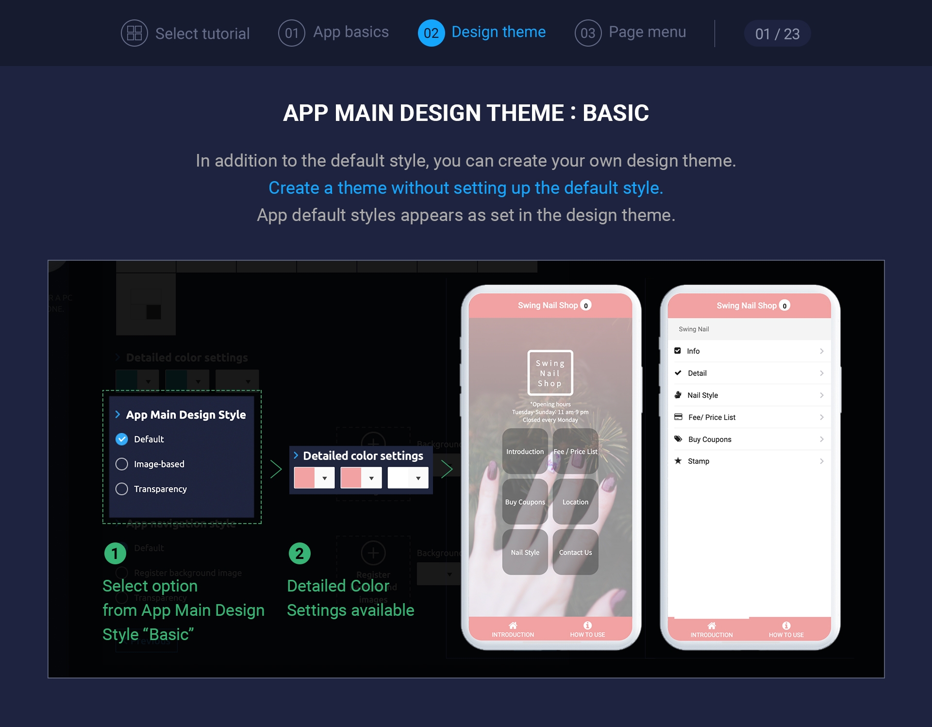
If you check [Default], other styles will not be applied, and the styles set in the design theme will be applied.
If you want to make a default style, please check ‘Default’.
2. App Main Design Style – Image-Based
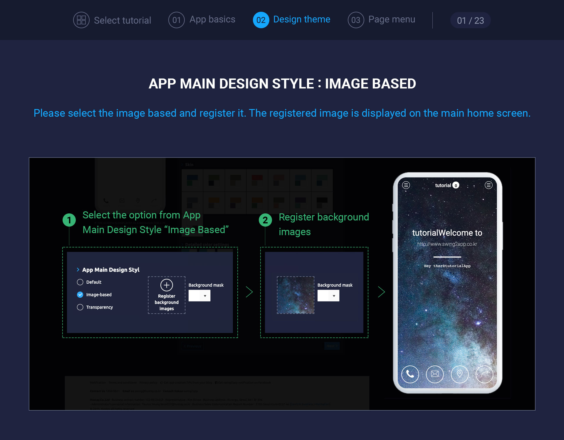
★ There is no recommended size for the background image to be included in the main design.
Based on the center of the background image, the horizontal size is 1024 pixels and the vertical size is 1900 pixels.
Therefore, when inserting a background image, it is recommended that you insert an image with good resolution and image quality so that the surrounding background, rather than a specific image, is cut off.

(Example image: Please put the background image like the above image)
If you put a normal background image, and it doesn’t fit well with the size of your phone screen, the image will be split or the image will be cropped.
*Image-based background images are entered into background images on the home screen.
Therefore, if you do not link the swing2app page as shown above, you may not see the image applied to the background.
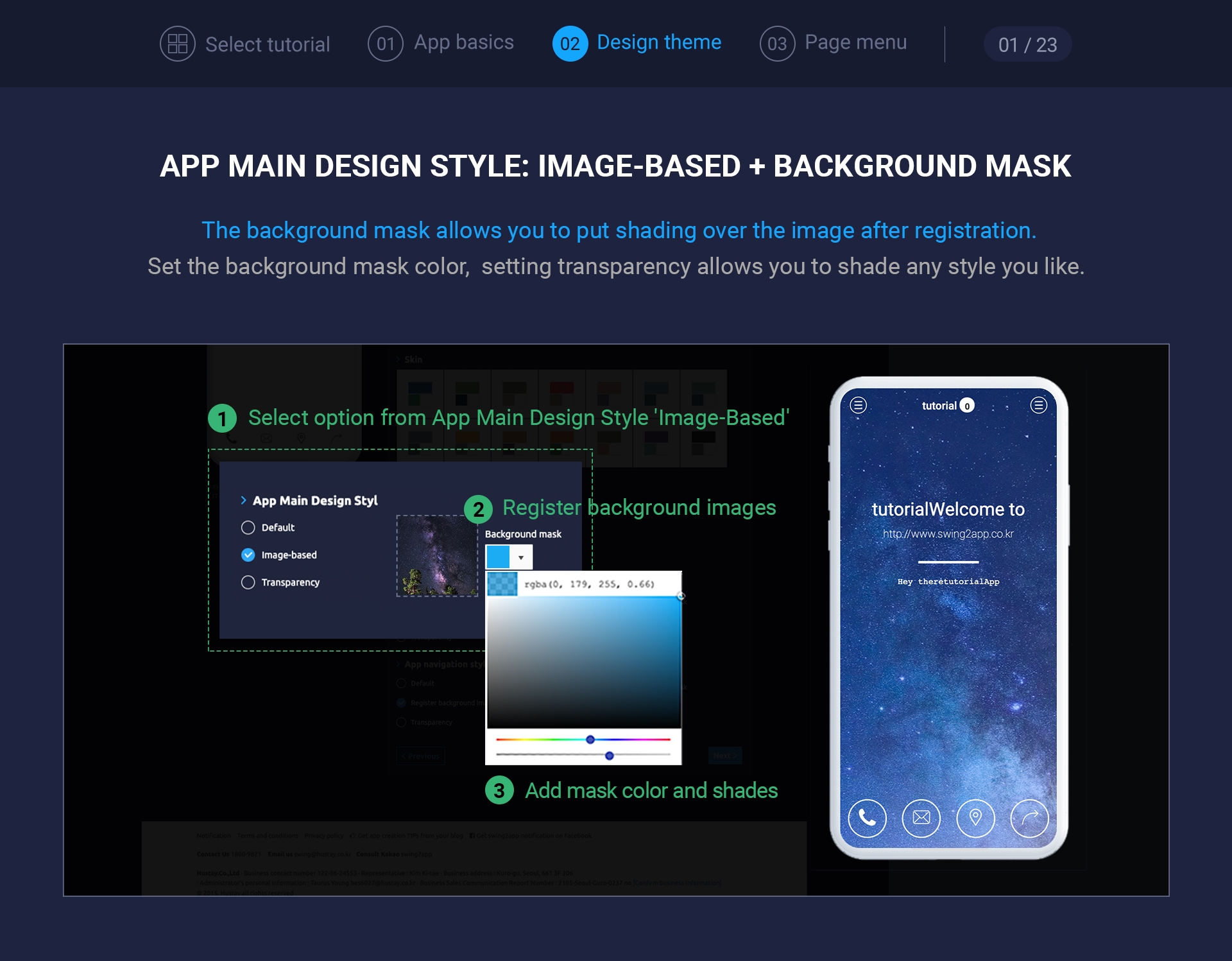
3. App Main Design Style – Image-Based + Background Mask
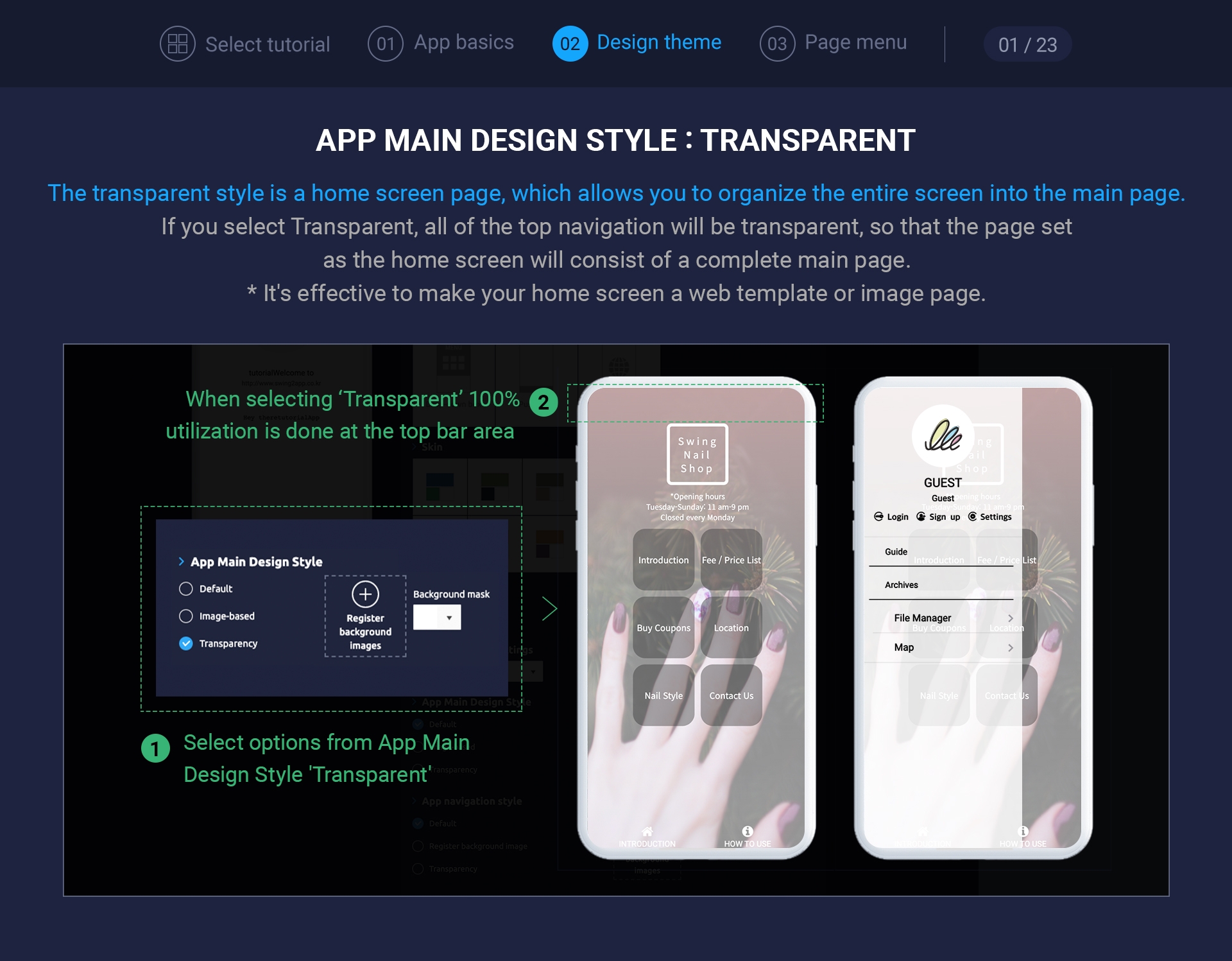 If you select [Transparency], the navigation on the top becomes transparent so that the applied web template appears as one main page.
And when you open the menu, you can see the background behind the menu, with transparent shades applied to the original design color (blue color).
If you compare the images when you set the default style above, you’ll understand how it’s different.
*The menu applied to the home screen of the above image is applied to the web template page – camping the main page.
★Additional TIP
When you set transparency in the main design style, the home screen is styled much better if you create it as a web template page or an image page.
★ Please also check how to set the app navigation style